
Table of contents

20 Beautiful Pop Up Design Examples of 2019
A collection of 20 of the most beautiful popups we have seen around the web in 2019
Table of contents
Adding an engaging and consistent design popup that aligns with your website is a great way to double the number of email subscribers you can collect from your blog or the number of users you can convert for your online store.
This is a technique we have seen throughout some of the most popular websites out there.
So based on this interesting fact, we have gathered a collection of 20 beautiful popups that you can get inspiration from to impact your website today.
Number 1, DesignModo.com
DesignModo presents a simple yet effective popup to collect email addresses in the bottom right hand side of the page. Its quite a simple design but has enough to engage and prompt the user to enter their email address for more.
The popup also only appears once you have scrolled down about halfway through the article this is a great way to maximise conversion since the reader would be engaged in the content.
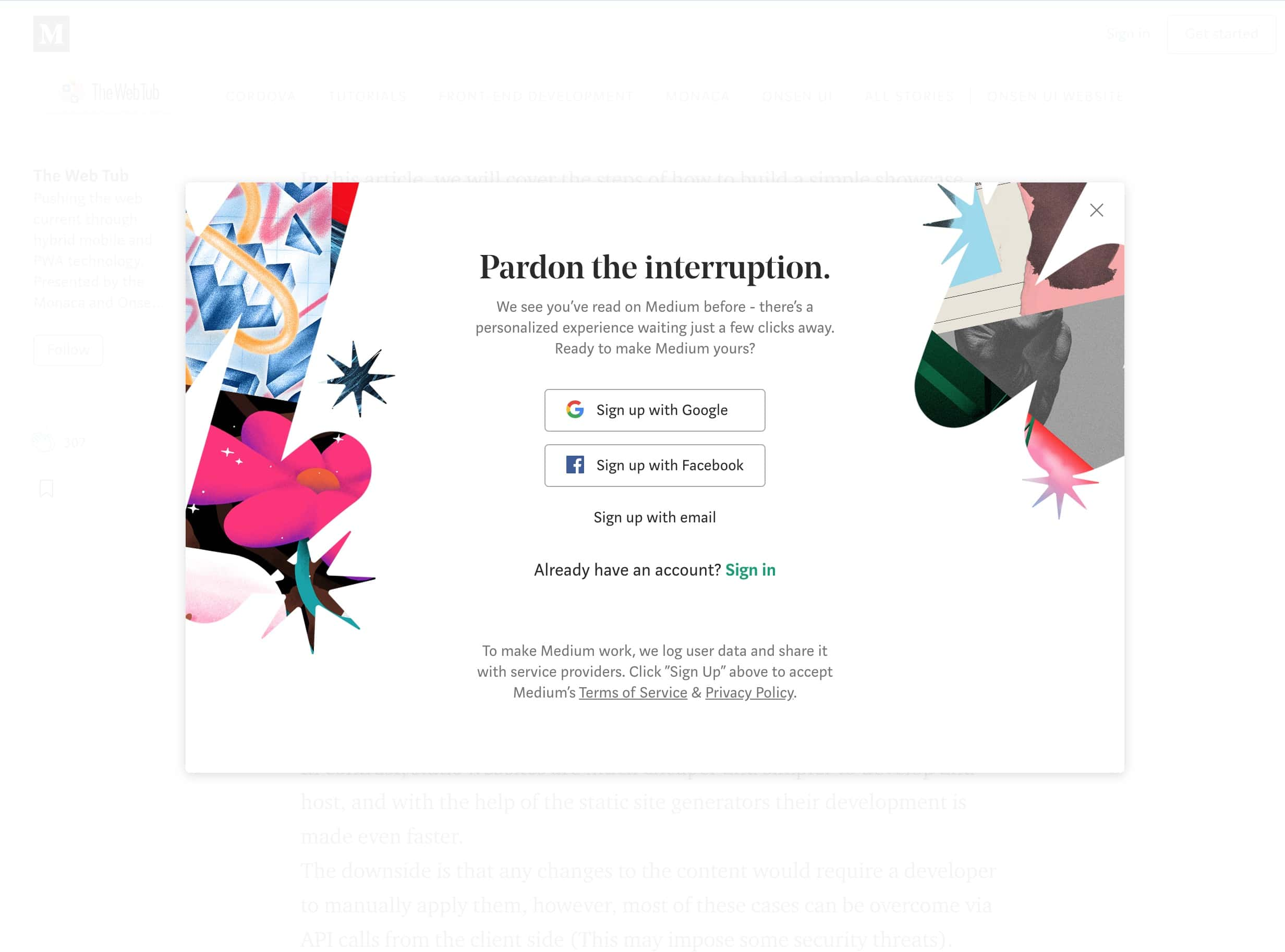
Number 2, Medium.com
One of the most popular blog websites online, Medium.com tries to engage users to join their website when you first visit, they present this straight to the point popup with a beautiful mixture of colours.
The popup is disruptive but does try to maximise the attention of users to convince them to join.
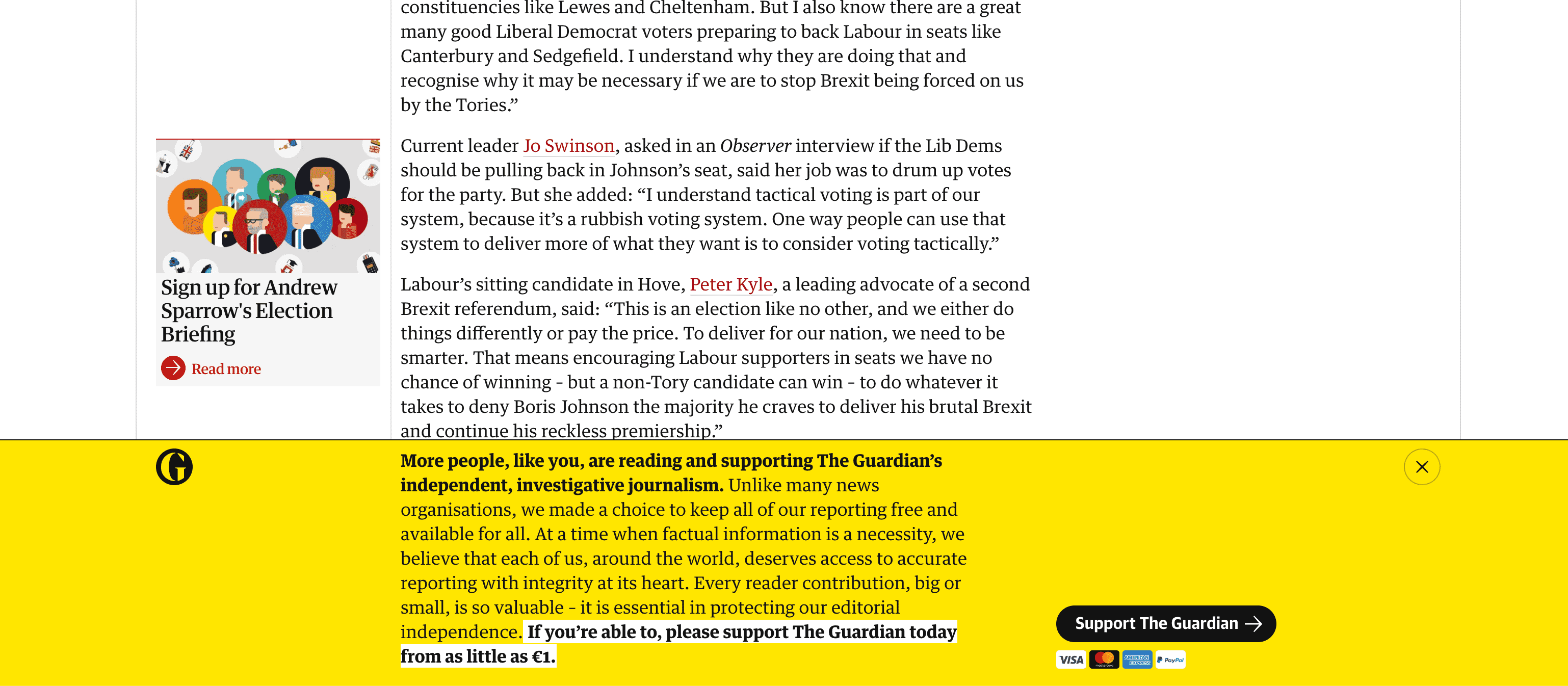
Number 3, Theguardian.com
A popular online newspaper, the Guardian does a great job attracting the attention of users to sign up to support the newspaper.
They present the popup as soon as the user arrives and on reload of the webpage. Each time the user can dismiss the popup, but its a great way to show the importance of the popup.
Number 4, nytimes.com
The New York times website is one of the best designed and most beautiful websites online today. In their usage of popups, one does a great job of encouraging users to signup and continue reading for free.
The popup appears once the user clicks a sticky bar at the bottom of the page, while scrolling the page the popup closes so the user has more visibility over the content.
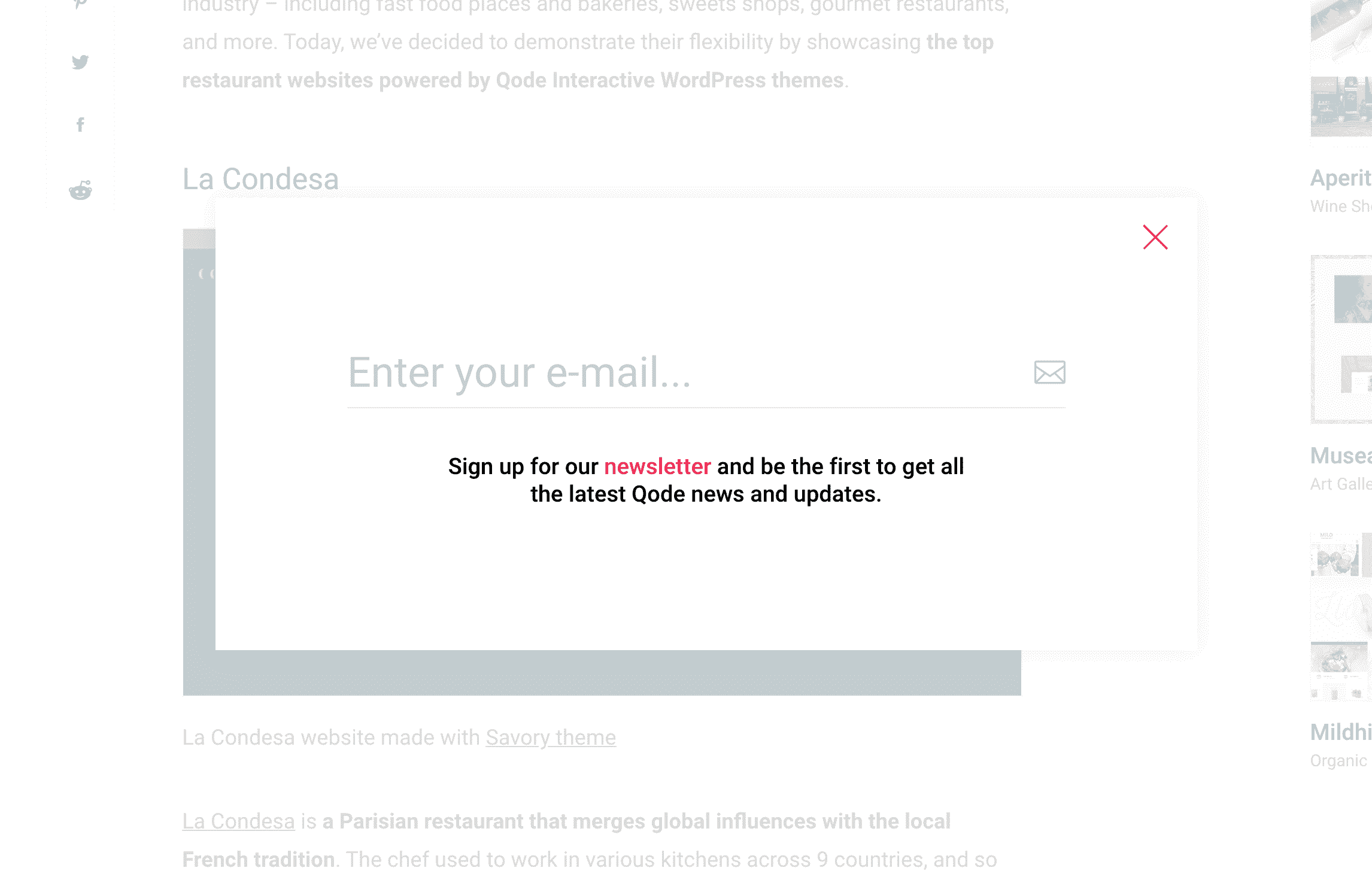
Number 5, Qodeinteractive.com
This is a simple yet effective popup that appears after reading about 10% of the article. It looks the user has to make a decision by locking their scroll, they either sign up or close the modal.
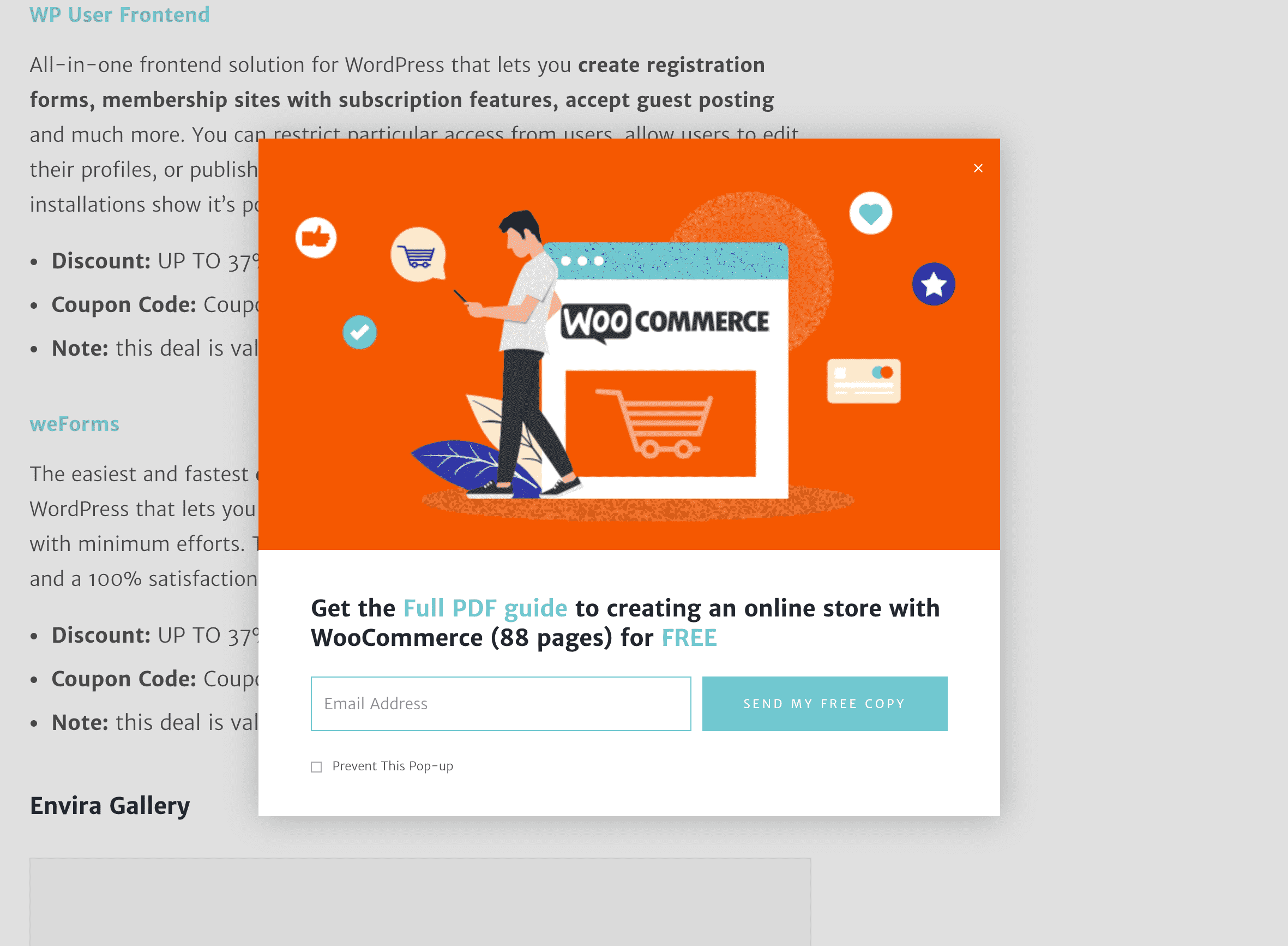
Number 6, WPklik.com
Another great example of a scroll triggered popup, once you scroll about 50% of the article, the modal pops to request the user to subscribe to the blog. They also try to encourage the user to engage by presenting a lead magnet to allow them to download a free PDF of something valuable for the reader.
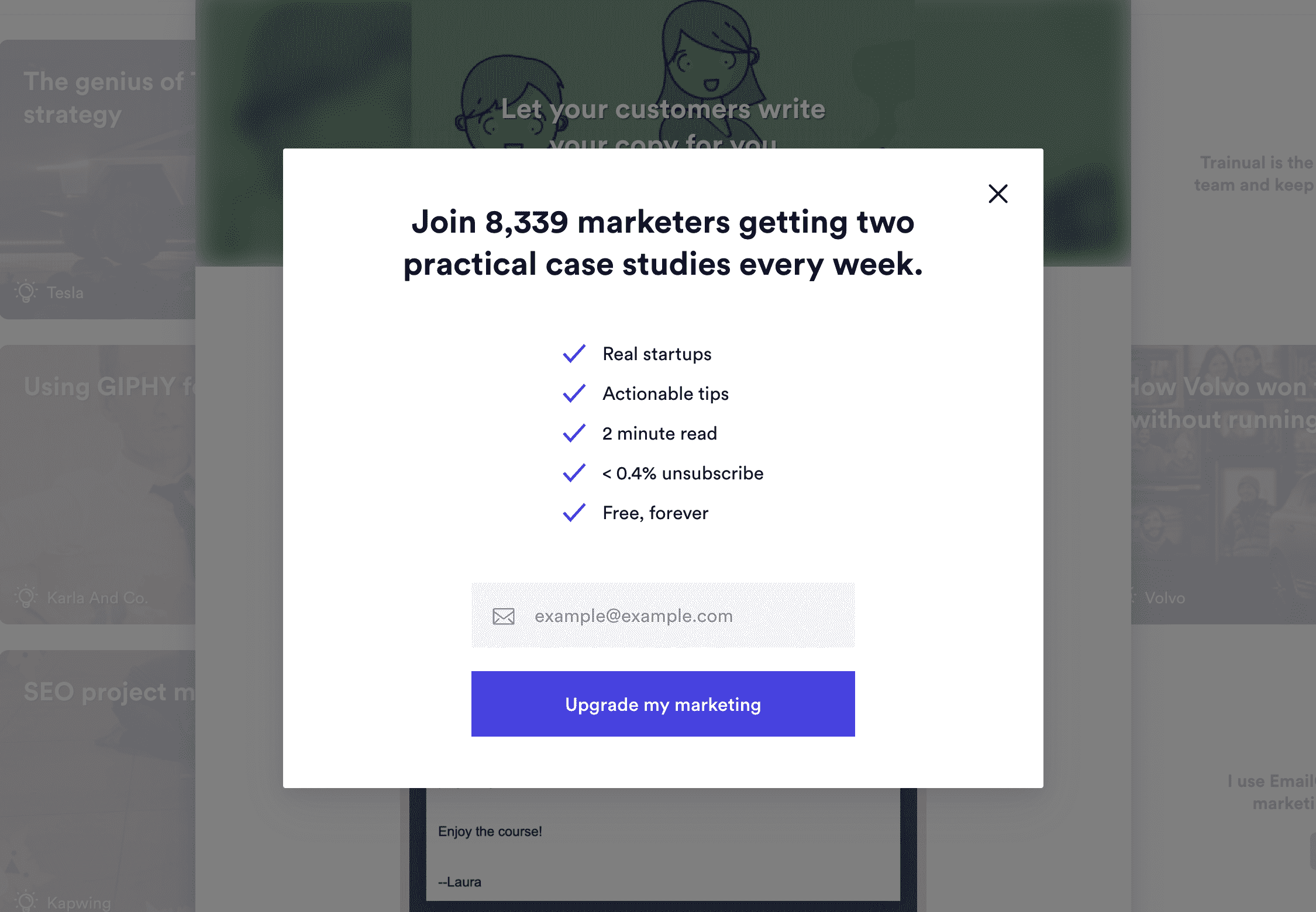
Number 7, Marketingexamples.com
As soon as you arrive, you are presented with a popup, the popup tries to encourage you to sign up by showing off over 8000 other people have done so. It also lists the advantages and what you should expect if you sign up.
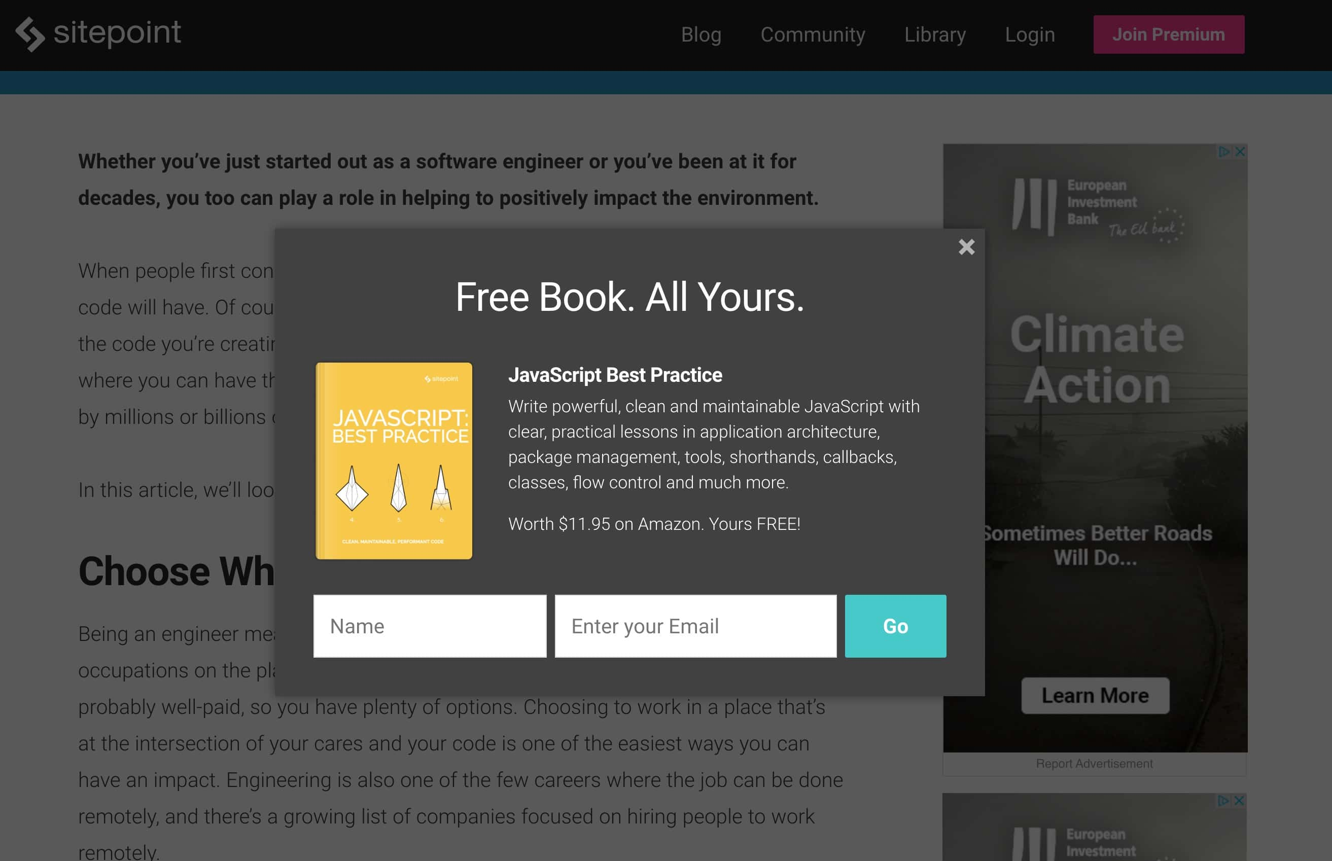
Number 8, Sitepoint.com
One of the most popular blogs to learn about website development, SitePoint presents a popup if the user has been on a page for a bit of time.
The popup tries to convince a user to sign up with their email by providing a free e-book on a book worth around 12 dollars. I'm sure this is quite effective.
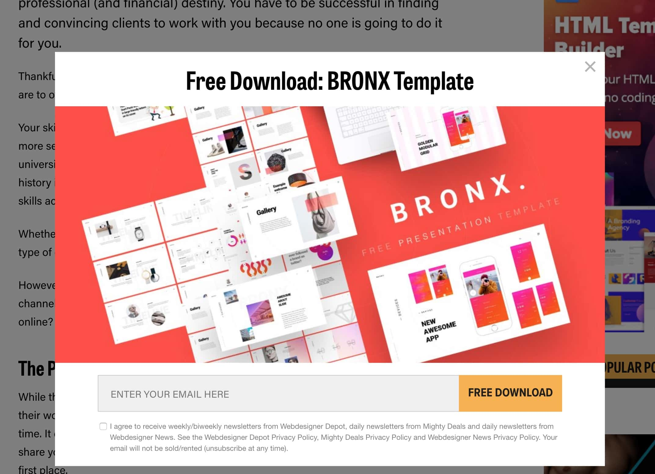
Number 9, Webdesignerdepot.com
Another popular online blog about website development, Web designer depot present their popup once you have read multiple articles on their website.
This popup tries to convince you to sign up by providing a free template.
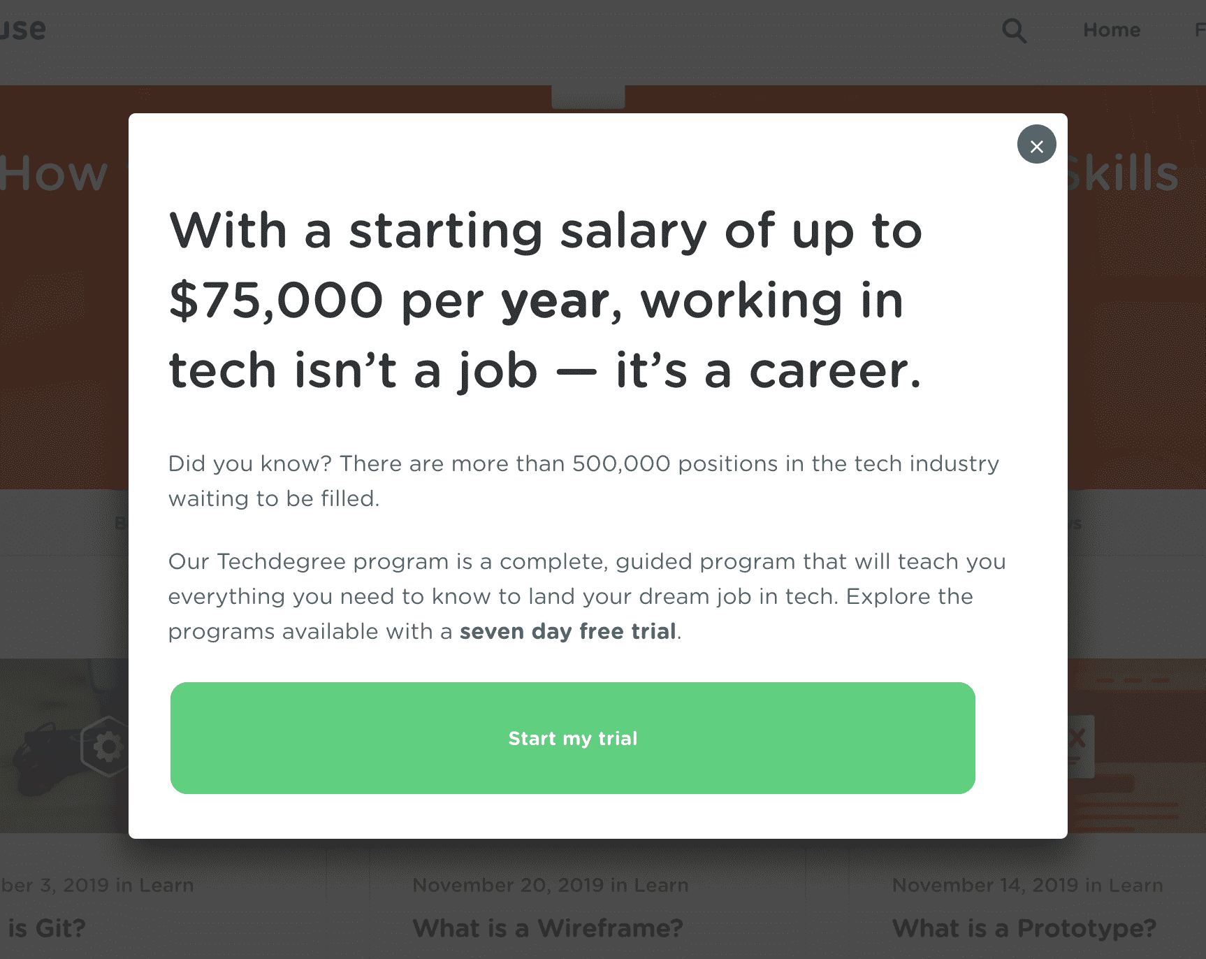
Number 10, Teamtreehouse.com
Team treehouse presents a popup to convince their readers to start a 7 day free trial, the copy in the popup targets people interesting in learning more about web development and the potential salary they can earn by learning from the tutorials TeamTreehouse provide.
The popup appears as soon as you arrive to the website.
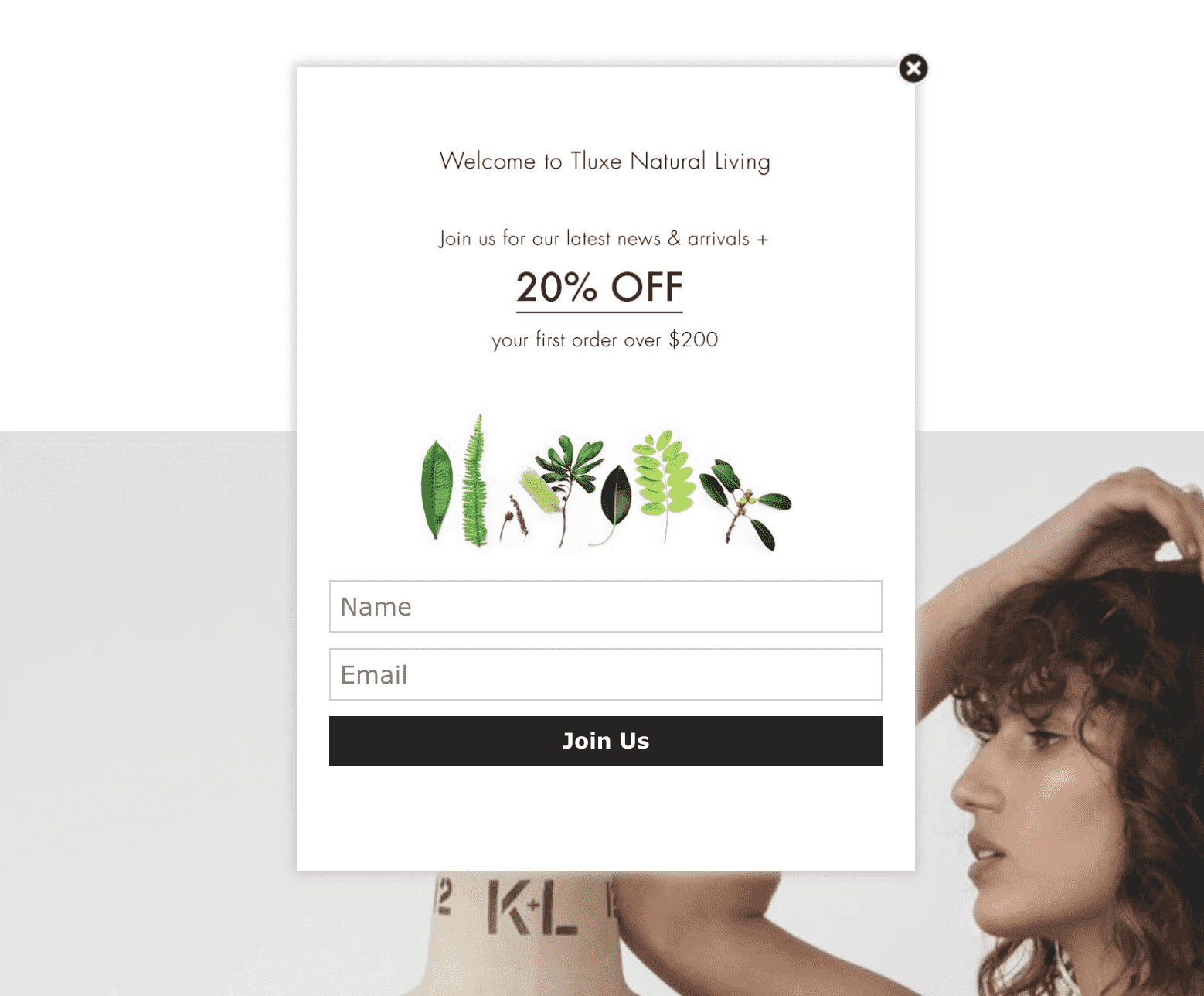
Number 11, Tluxe.com
A simple yet effective popup, this popup gets straight to the point once someone arrives to the website. The popup convinces the reader to sign up by providing a 20% discount on the first offer over 200 dollars. This is a simple way to convince more people to make the initial purchase.
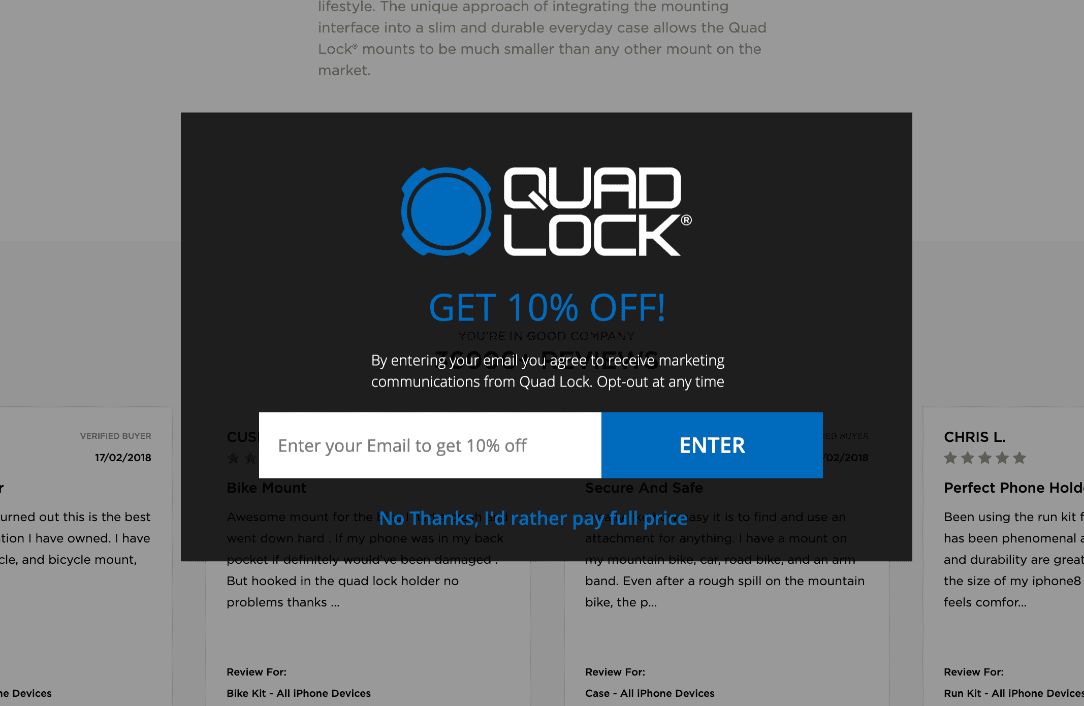
Number 12, Quadlockcase.com
Another e-commerce popup, this popup tries to convince the user to sign up in order to get a 10% discount, this popup appears once you first arrive but creates a slight fear that this is a once time offer that only new visitors receive.
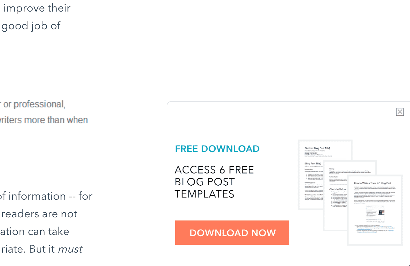
Number 13, Hubspot.com
Hubspot are one of the top companies around inbound marketing and in their blog they do a great job presenting a subtle popup to encourage users to click the button and download a PDF containing valuable information. This is simply a call to action popup that directs the motivated user to another part of the website, there they are convinced to sign up with their email address to get the PDF.
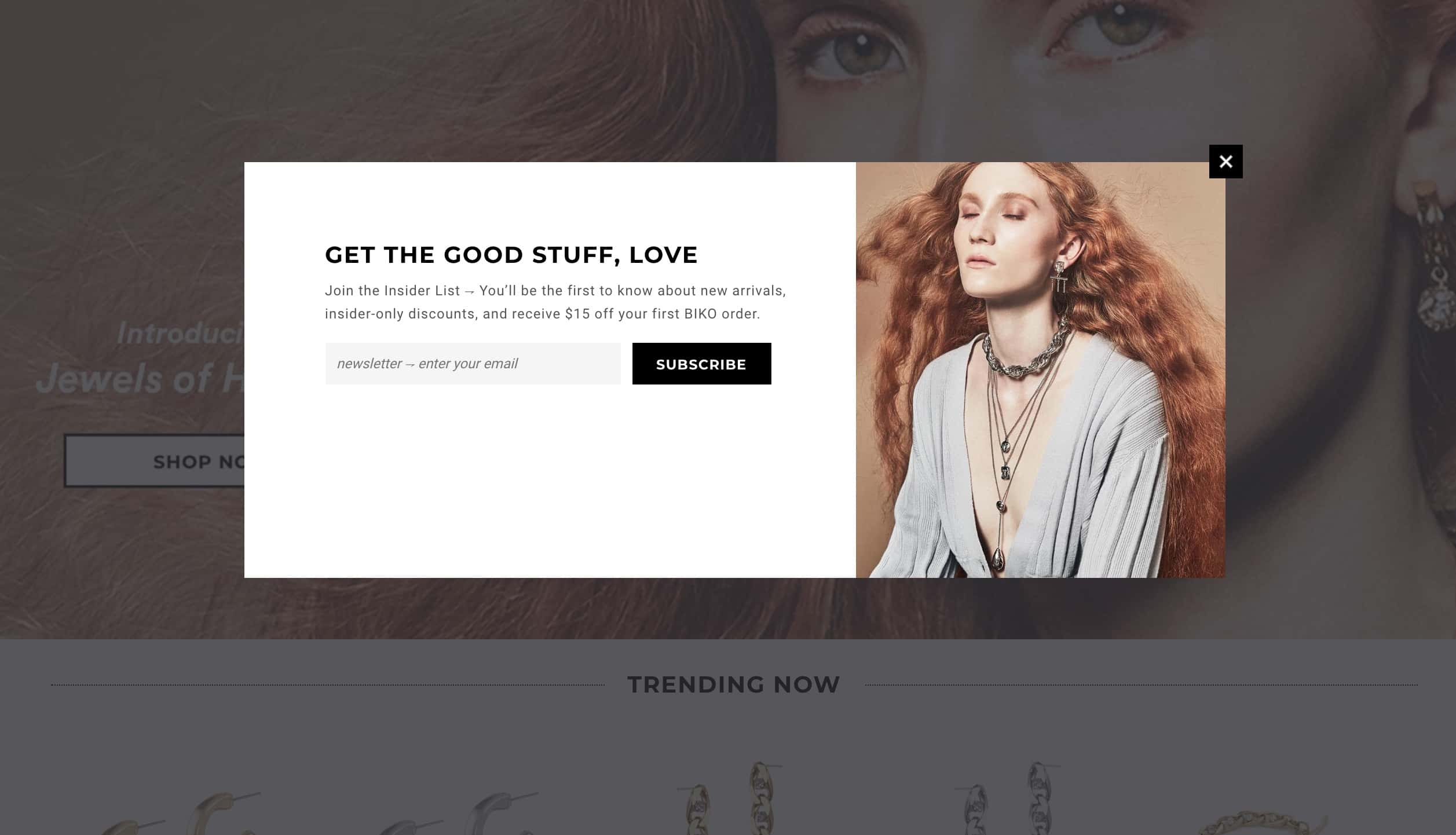
Number 14, ilovebiko.com
This popup is shown as soon as you arrive, but the copy does most of the work here. It advertises a unique offer to join the insider list where you'll be the first to know about new arrivals and insider only discounts.
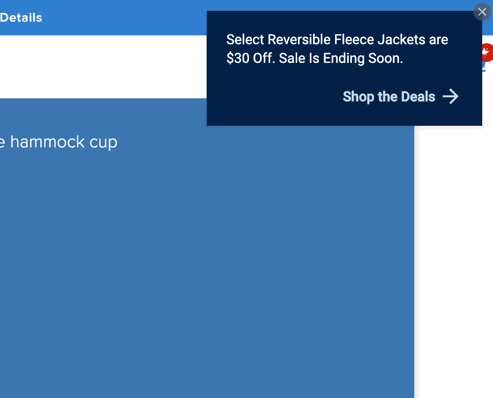
Number 15, Chubbiesshorts.com
This is a small but effective way to advertise a sale occuring on the website, it presents a sense of urgency since the copy mentions the sale will be ending soon and that you can get up to 30 dollars off a jacket.
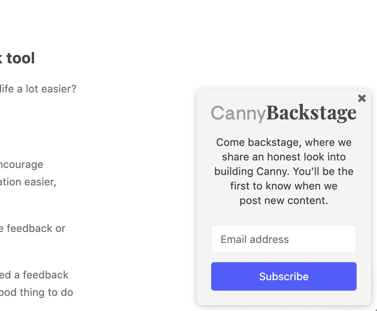
Number 16, Canny.io
One of the most beautiful websites online, Canny.io presents a small popup to encourage users to sign up to get behind the scenes information into how the team behind Canny.io are building it.
The popup remains visible throughout the blog article but can be easily dismissed.
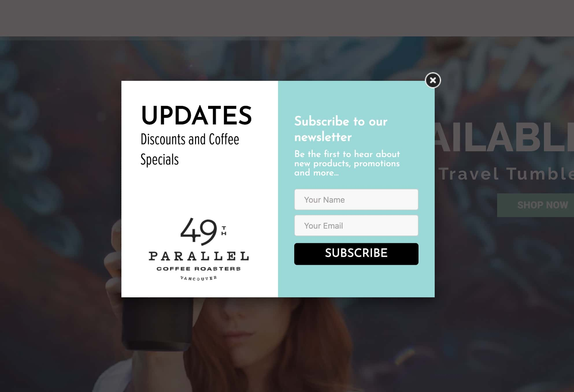
Number 17, 49thcoffee.com
49thcoffee presents a popup once you arrive to their website to encourage users to sign up with their email address and first name, they advertise that the user will receive discounts and specials on coffee.
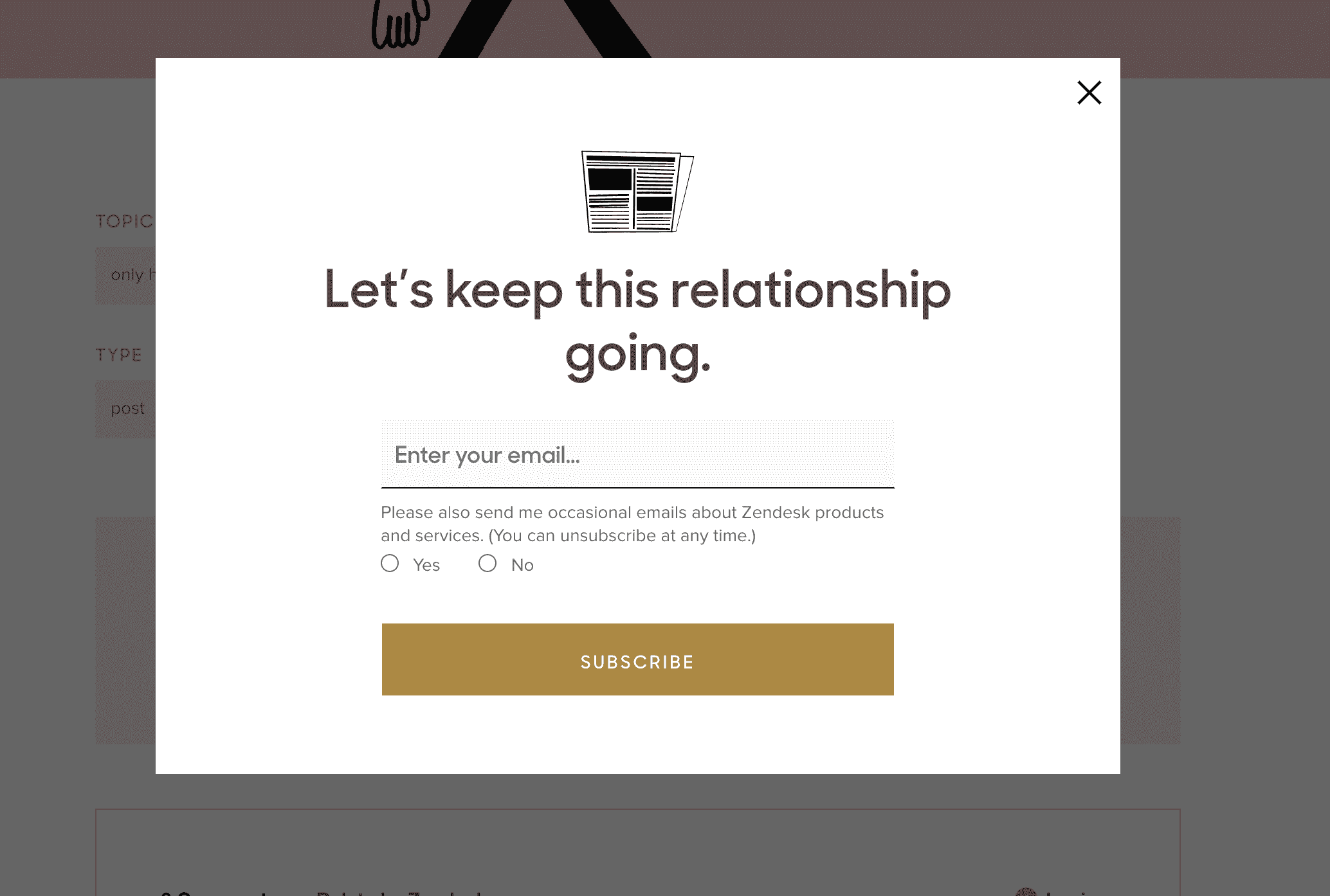
Number 18, Zendesk.com
This popup to encourage users to subscribe is one of the best non-intrusive approaches to getting users to subscribe, to see the popup the user must click a subscribe CTA inlined in the page of the article.
On top of that, if a user wants to hear about the products Zendesk provides, they need to opt-in and declare they want to be in the know.
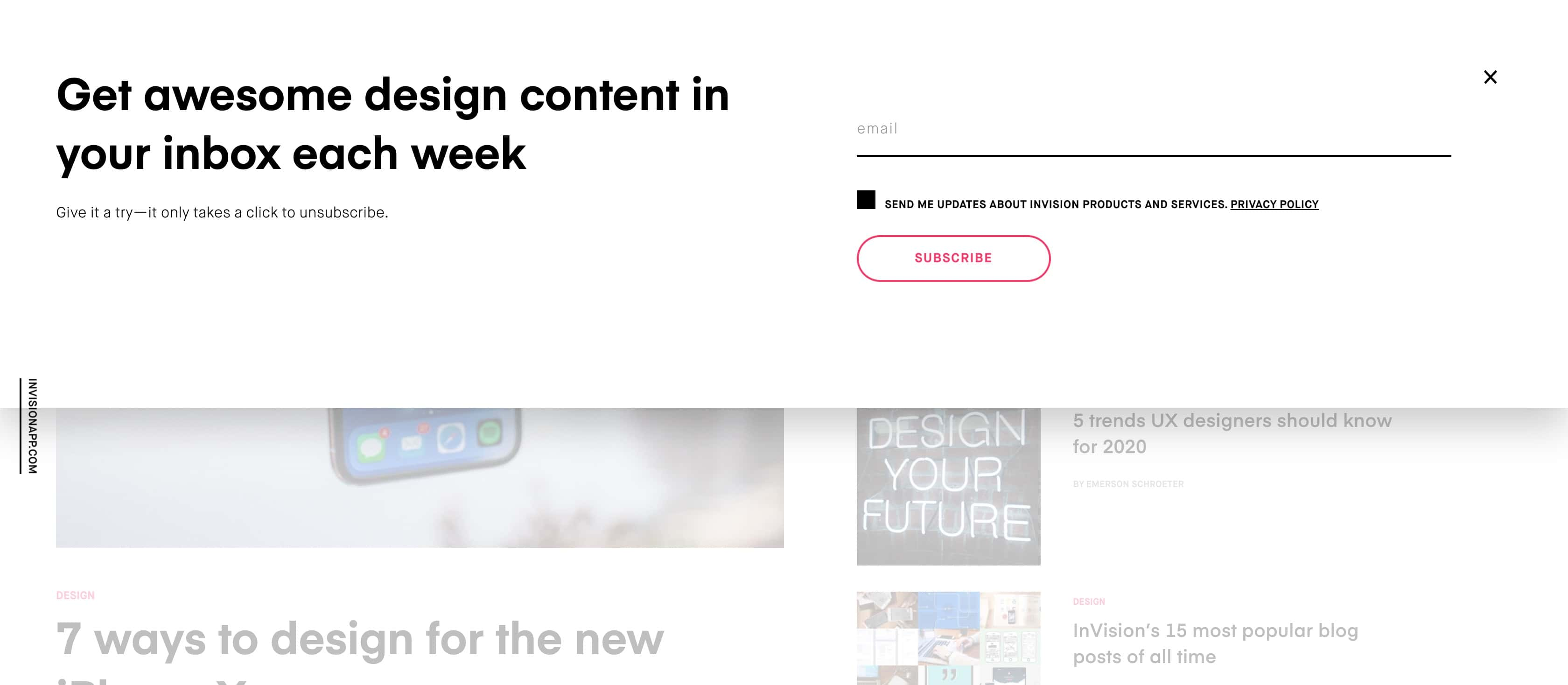
Number 19, Invisionapp.com
Invision does a great job at maximum conversion by ensuring the popup only displays if the user has intent, they do this by inlining a subscribe button into the page and only when the user clicks it, does the popup appear.
Even the copy encourages the user to convert, they use the power word Awesome or even say give it a try, trying to indicate its super easy to sign up.
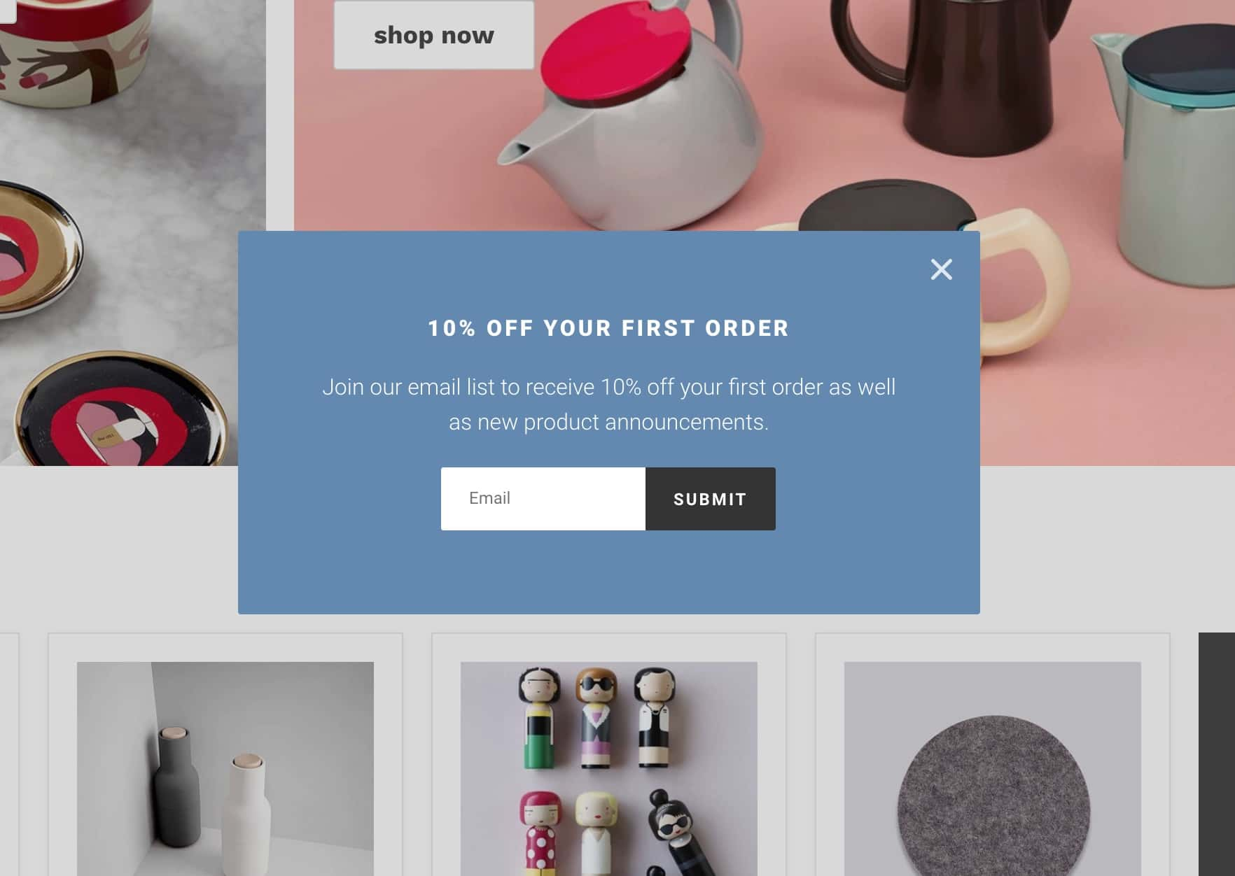
Number 20, Themodernshop.com
This popup appears advertising to the user the potential to receive 10% of the first order and to get the latest updates on new product orders.
Related posts
Discover the latest news from Embedery while learning about interesting topics

12 excellent video popup ideas to boost engagement
Driving engagement on your website can be difficult, especially when visitors are looking for something specific or when they fail to find the value in what you have to offer.
15 Popup design examples that work
A collection of 15 popups that drive results.
20 Beautiful Pop Up Design Examples of 2019
A collection of 20 of the most beautiful popups we have seen around the web in 2019