Table of contents
What is a preloader and how can it be used with SAAS
A preloader is a loading screen that is displayed before the main content of a webpage is loaded. Preloaders are often used to improve the user experience by providing visual feedback that the webpage is actively loading and preventing users from interacting with the page until it is fully loaded.
Table of contents
To use a preloader with SASS, you will first need to create a loading screen design and implement it in your HTML and CSS files. Then, you can use JavaScript or a JavaScript library like jQuery to trigger the preloader to display while the main content of the page is loading.
Some benefits

-
Improved user experience: Preloaders provide visual feedback to users that the page is actively loading, which can help to reduce frustration and improve the overall user experience.
-
Increased perceived performance: Preloaders can make your web application feel faster and more responsive, even if the actual page load time doesn't change. This is because preloaders give users something to look at while the page is loading, which makes the waiting time feel shorter.
-
Reduced bounce rate: If a webpage takes too long to load, users may become frustrated and leave the page before it finishes loading. By using a preloader, you can keep users engaged and reduce the likelihood that they will leave the page before it fully loads.
-
Enhanced branding: Preloaders can be designed to match your brand's style and color scheme, which can help to improve the overall look and feel of your web application.
-
Improved accessibility: Preloaders can help to improve the accessibility of your web application by providing a loading indicator for users with disabilities, such as users who are using screen readers. This can help to ensure that all users have a positive experience when using your web application.
The differences between a preloader, loading screen, and skeleton loading
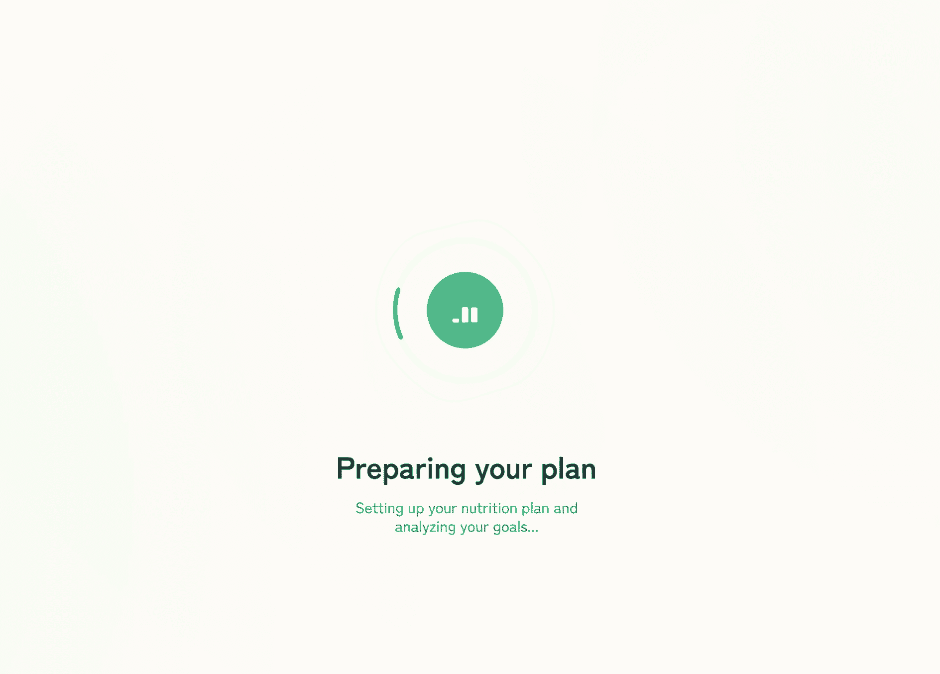
Preloader, loading screen and skeleton screens are all techniques that can be used to improve the user experience while a webpage is loading. However, they differ in terms of their implementation and the specific benefits they provide.

A preloader is a loading screen that is displayed before the main content of a webpage is loaded. Preloaders are often used to provide visual feedback that the webpage is actively loading and prevent users from interacting with the page until it is fully loaded.
A loading screen is a full-screen display that is shown while the main content of a webpage is loading. Loading screens can be used to provide information about the progress of the load, or to display branding or marketing messages.
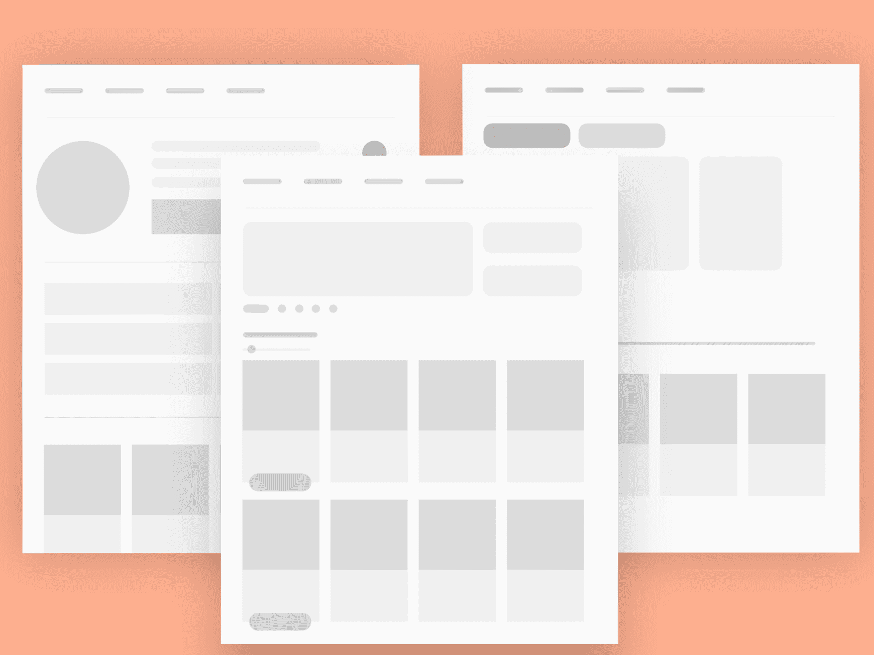
Skeleton screens, also known as "placeholder UI" or "content loading states," are used to display a rough outline of the layout and content of a webpage while it is loading. Skeleton screens are often used to give users an indication of the structure and content of the page, and can help to improve the perceived performance of the webpage by giving users something to look at while the page is loading.
In general, preloaders and loading screens are used to provide feedback to users that the page is actively loading, while skeleton screens are used to give users an idea of the content and layout of the page before it is fully loaded. You can choose to use one or more of these techniques in your web application, depending on your specific needs and goals.
Mobile browser considerations
A preloader can have a similar effect on a mobile browser as it does on a desktop browser when interacting with a SASS web application. Specifically, the preloader can improve the user experience by providing visual feedback that the page is actively loading and preventing users from interacting with the page until it is fully loaded.
However, it's important to consider the impact that a preloader may have on the performance of your web application on mobile devices. Mobile devices often have slower processors and less available memory compared to desktop computers, so it's important to ensure that your preloader is optimized for mobile performance.
One way to do this is to minimize the size and complexity of the preloader. For example, you might use a simple loading animation rather than a more complex one, or you might use a lightweight preloader library like Ladda or Spin.js. You should also consider the impact of the preloader on the overall page load time, as longer load times can lead to increased bounce rates on mobile devices.
It's also a good idea to test your preloader on a variety of mobile devices to ensure that it is working correctly and performing well across different platforms. This can help you to identify any potential issues and ensure that your preloader is providing a positive user experience on mobile devices.
How to implement a preloader with jQuery?
- Create a container element for the preloader in your HTML file, and add a loading animation or message to it:
<div id="preloader">
  <div class="loading">Loading...</div>
</div>
- Add some CSS styles to position and style the preloader:
#preloader {
  position: fixed;
  top: 0;
  left: 0;
  width: 100%;
  height: 100%;
  background-color: #ffffff;
  z-index: 99999;
}

.loading {
  position: absolute;
  top: 50%;
  left: 50%;
  transform: translate(-50%, -50%);
  font-size: 24px;
  font-weight: bold;
  color: #000000;
}
- Use jQuery to show the preloader while the main content is loading, and then hide it when the page is fully loaded:
$(window).on("load", function () {
  $("#preloader").fadeOut();
});
You can customize this basic example by adding additional HTML elements or CSS styles to the preloader, or by using a preloader library like Ladda or Spin.js to create more complex loading animations.
How to implement a Preloader with React.js
- Create a component for the preloader in your React application. This component should render the HTML and CSS for the preloader, and use JavaScript to trigger the preloader to display while the main content is loading:
import React from "react";

function Preloader() {
  return (
    <div id="preloader">
      <div class="loading">Loading...</div>
    </div>
  );
}

export default Preloader;
- Add some CSS styles to position and style the preloader. You can either include these styles in a separate CSS file or use a CSS-in-JS library like styled-components to define the styles in your JavaScript code:
#preloader {
  position: fixed;
  top: 0;
  left: 0;
  width: 100%;
  height: 100%;
  background-color: #ffffff;
  z-index: 99999;
}

.loading {
  position: absolute;
  top: 50%;
  left: 50%;
  transform: translate(-50%, -50%);
  font-size: 24px;
  font-weight: bold;
  color: #000000;
}
- Use the
useEffecthook to show the preloader while the main content is loading, and then hide it when the page is fully loaded. You can do this by setting thedisplaystyle of the preloader element tononewhen the page is finished loading:
import React, { useEffect } from "react";

function Preloader() {
  useEffect(() => {
    const preloader = document.getElementById("preloader");
    window.addEventListener("load", () => {
      preloader.style.display = "none";
    });
  }, []);

  return (
    <div id="preloader">
      <div class="loading">Loading...</div>
    </div>
  );
}

export default Preloader;
- Render the
Preloadercomponent in your main layout component, and wrap the main content of the page in adivelement with anidofmain-content. This will allow you to target the main content element with JavaScript and hide it while the preloader is displayed:
import React from "react";
import Preloader from "./Preloader";

function Layout() {
  return (
    <div>
      <Preloader />
      <div id="main-content">{/* main content goes here */}</div>
    </div>
  );
}

export default Layout;
You can customize this basic example by adding additional HTML elements or CSS styles to the preloader, or by using a preloader library like Ladda or Spin.js to create more complex loading animations.
Some best practices for using a preloader
- Keep it simple: Preloaders should be minimal and straightforward, and should not distract users from the main content of the webpage. Avoid adding unnecessary elements or animations to the preloader, and keep the design clean and uncluttered.
- Make it visually appealing: Preloaders should be visually appealing and consistent with the overall design of your web application. Use colors and fonts that match your brand, and consider using a loading animation or other visual element to make the preloader more engaging.
- Keep it small: Preloaders should be as small and lightweight as possible to minimize the impact on page load time. Avoid using large images or other heavy assets in the preloader, and consider using a preloader library like Ladda or Spin.js to create more complex loading animations without increasing the size of the preloader.
- Make it accessible: Preloaders should be accessible to users with disabilities, such as users who are using screen readers. This can be achieved by including alt text for images and using semantic HTML elements to convey the purpose of the preloader.
- Test it on multiple devices: Preloaders should be tested on a variety of devices and browsers to ensure that they are working correctly and performing well across different platforms. This will help you to identify any potential issues and ensure that your preloader is providing a positive user experience for all users.
If you are looking for some apps to help boost your Shopify stores impact, check out this article.
Some examples
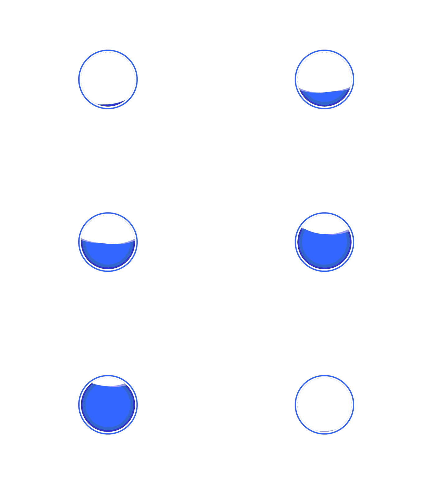
- Simple loading spinner: A simple loading spinner is a common type of preloader that is often used to indicate that a webpage is actively loading. These preloaders consist of a single animated element, such as a spinning circle or bar, that is displayed in the center of the screen.
- Full-screen preloader: A full-screen preloader is a preloader that takes up the entire screen and is often used to provide branding or marketing messages while the webpage is loading. These preloaders often include images or graphics, as well as text or other information about the company or product.
- Skeleton screen: A skeleton screen, also known as a "placeholder UI" or "content loading state," is a preloader that displays a rough outline of the layout and content of a webpage while it is loading. Skeleton screens are often used to give users an indication of the structure and content of the page, and can help to improve the perceived performance of the webpage by giving users something to look at while the page is loading.
- Progress bar: A progress bar is a type of preloader that displays the progress of the page load as a percentage or bar. These preloaders can be used to give users an indication of how much of the page has loaded and can be customized to match the branding and design of the web application.
- Loading animation: A loading animation is a type of preloader that uses a series of images or graphics to create an animated loading effect. These preloaders can be as simple as a spinning circle or as complex as a custom animation and can be used to add some visual interest to the loading screen.
Some real world examples
Here are some real world examples of great uses of a preloader.
Slack
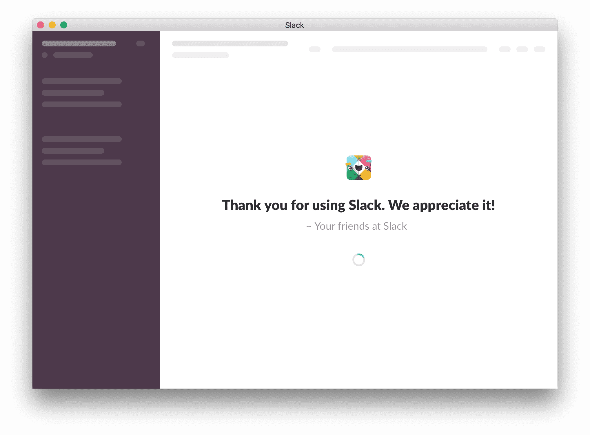
Slack is a frontend heavy application, and they do a great job engaging the user by presenting some helpful tips and contextual information.
Asana
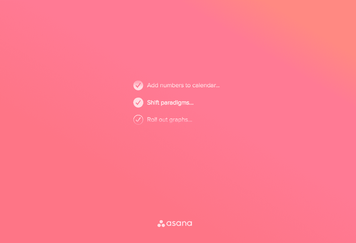
Another frontend heavy application, Asana has some very smooth animations that keep the app engaging and informative.
Duolingo

Duolingo are masters of embedding animated characters into their app, and their preloader does a great job at that.
Gmail
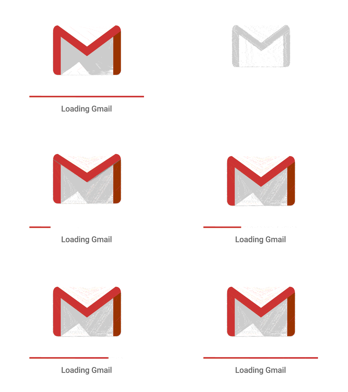
Gmail provides an informative progress bar but keeps it exciting with the animated email animation.
Evernote
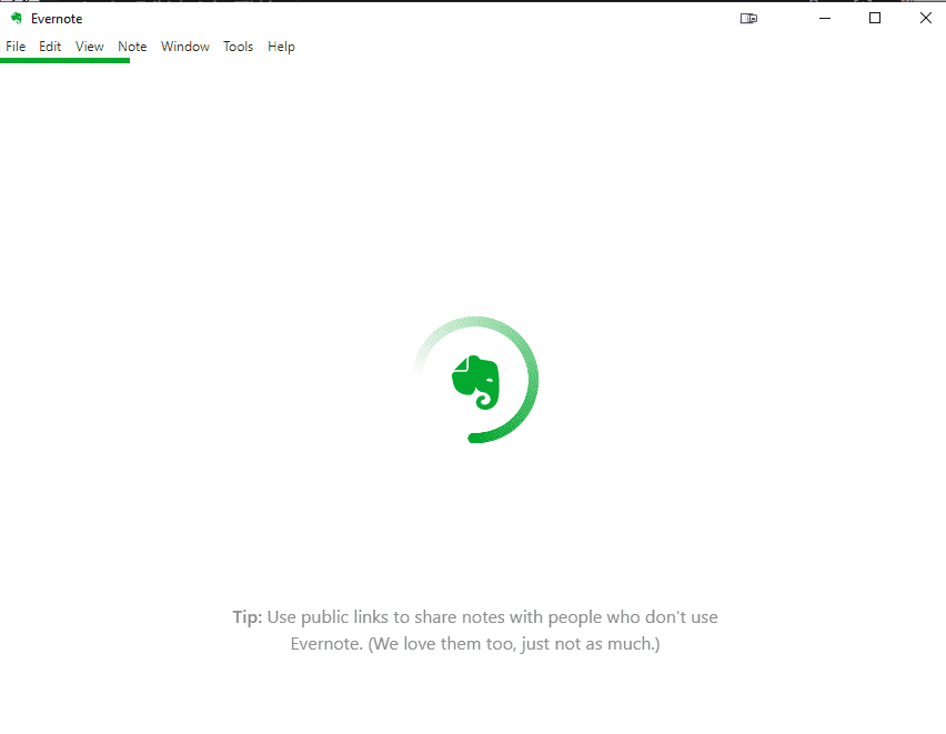
Evernote keep it simple with a spinner and a centered logo, but they also provide some valuable tips to engage the visitor.
Related posts
Discover the latest news from Embedery while learning about interesting topics
10 strategies to increase your Shopify sales
We have gathered 10 strategies to help you grow your Shopify store to amazing success.

12 excellent video popup ideas to boost engagement
Driving engagement on your website can be difficult, especially when visitors are looking for something specific or when they fail to find the value in what you have to offer.

15 Popup design examples that work
A collection of 15 popups that drive results.

