

Editing your popup
A getting started guide on the popup editor
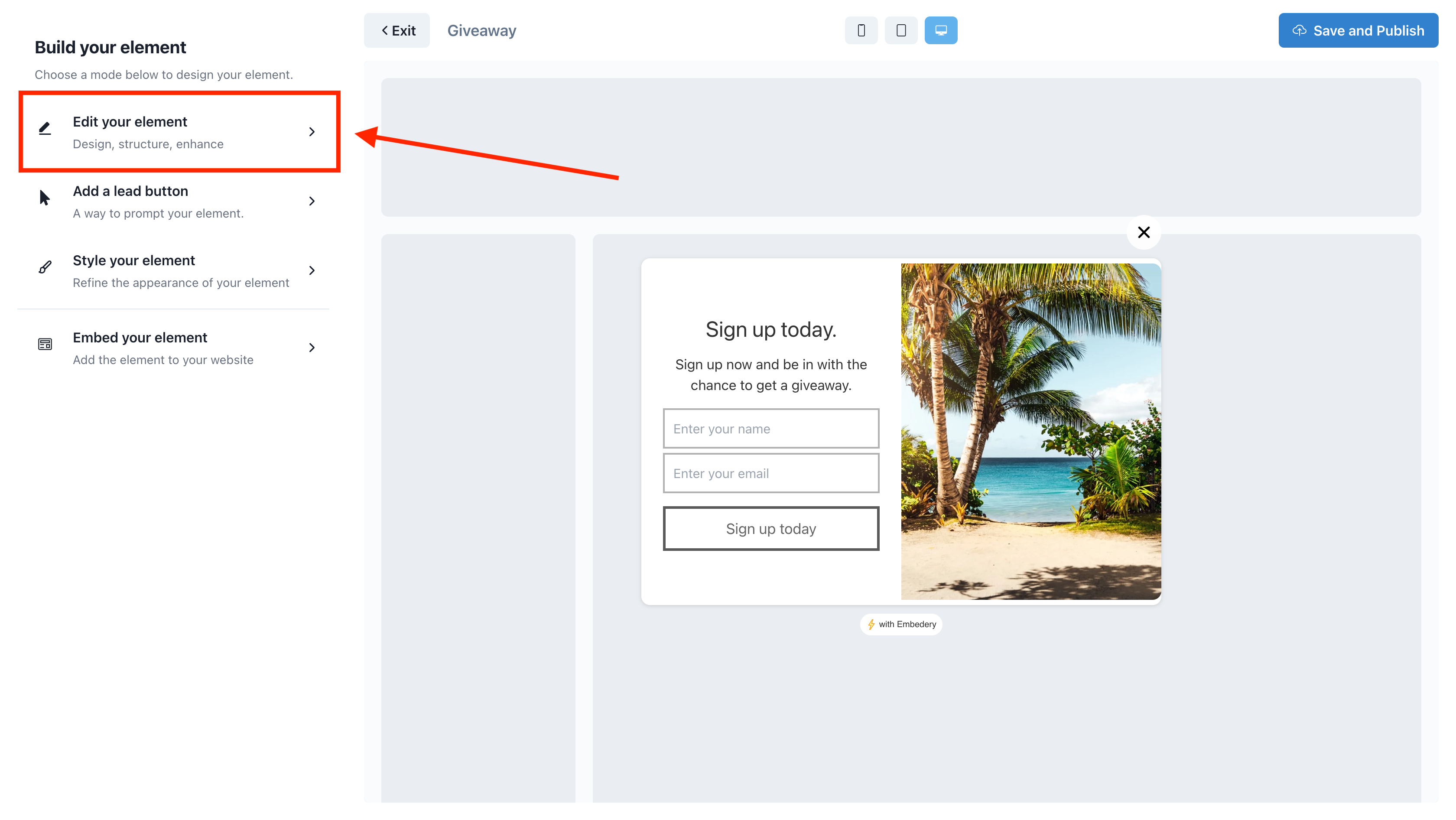
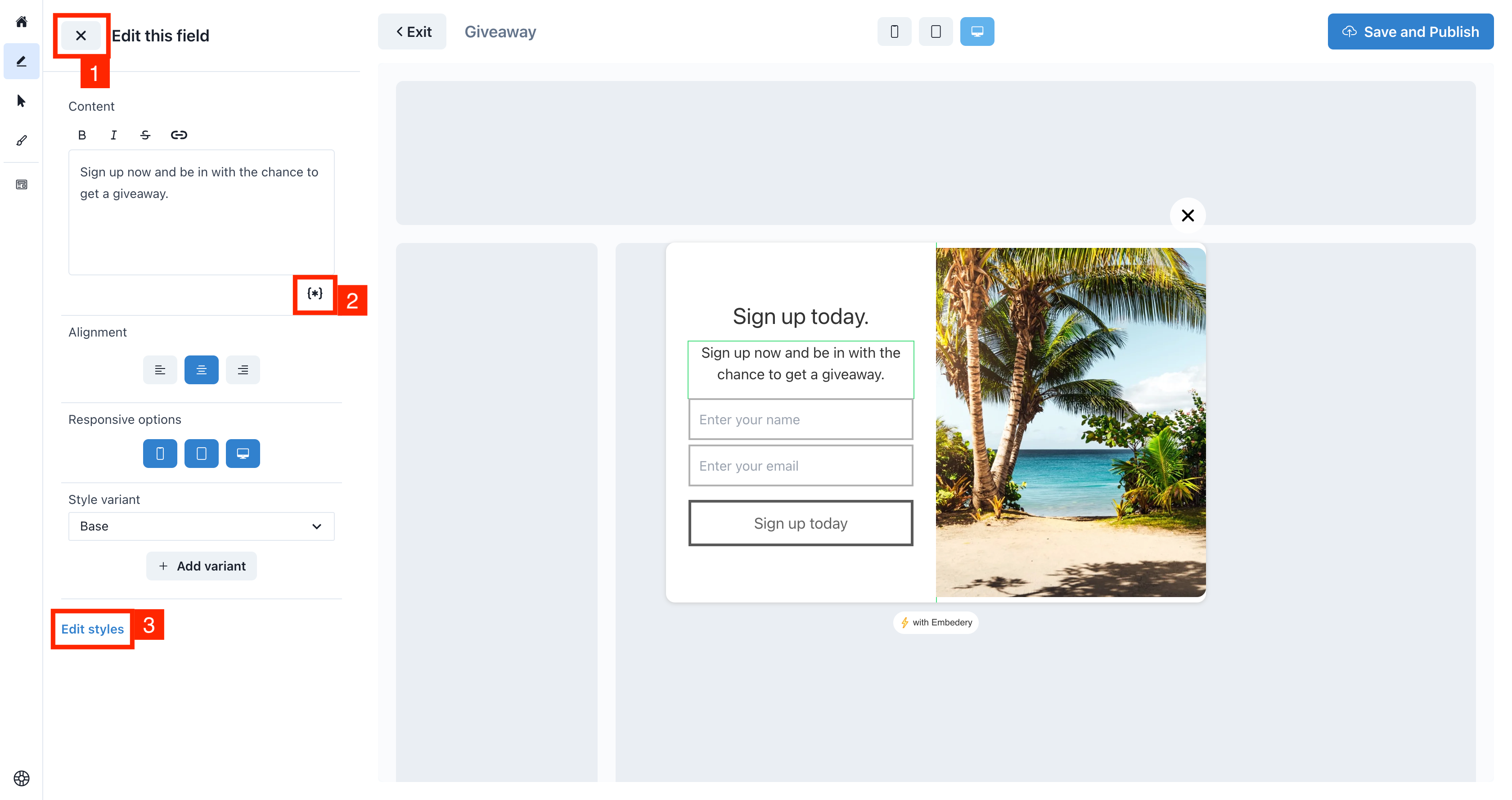
To edit your popup, ensure you are in the in web element editor and click on the first section titled "Edit your element"
The important parts
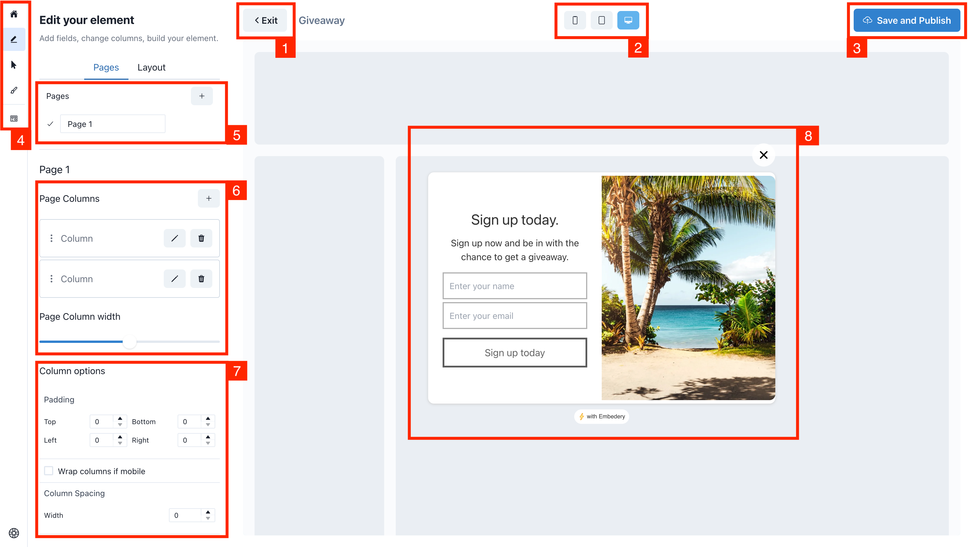
Above we have numbered different sections relevant to how you interact and edit your element.
The sections are:
1. The exit button
Click this button to leave the editor, if you have changes you will be prompt to save before exiting.
2. The responsive viewer
Change the responsive view of your element to see how the element will look on mobile, tablet and desktop.
3. Save and publish
To save your changes and publish a new version, click this button.
4. The mini navigation menu
Use this to quickly navigate to the different sections of the editor. Hovering the menu items will provide a tooltip explaining what section will open.
5. The page switcher
Use this to add new pages, edit the page name and to switch to a new page. Pages are useful to display a message after a form has been submitted or to provide a multistep experience to your users.
6. Page column settings
Here you can add columns, remove them and change their order by dragging them up or down. You can also edit the individual column, which we'll explain later in this article.
You can also change the column width, by using the slider. Drag it back and forth to alter the width of your columns. Also double clicking the handle will reset back to the default size.
7. Overall column options
Here you can manage how your columns shared style, such as:
- The padding field will be applied to both columns
- You can tell your columns to wrap for mobile
- You can set a gap between your columns.
8. The live preview
Here you can see a live preview of how your element will look.
You can hover over fields and click to edit them. This will update the left sidebar with field specific options.
Moving around
Clicking the background of your element will close the left sidebar and open the parent item.
For example, if the structure is:
- Page
- Column
- Field
- Column
And field is selected, clicking the background will open the column settings. Click again will open the page settings.
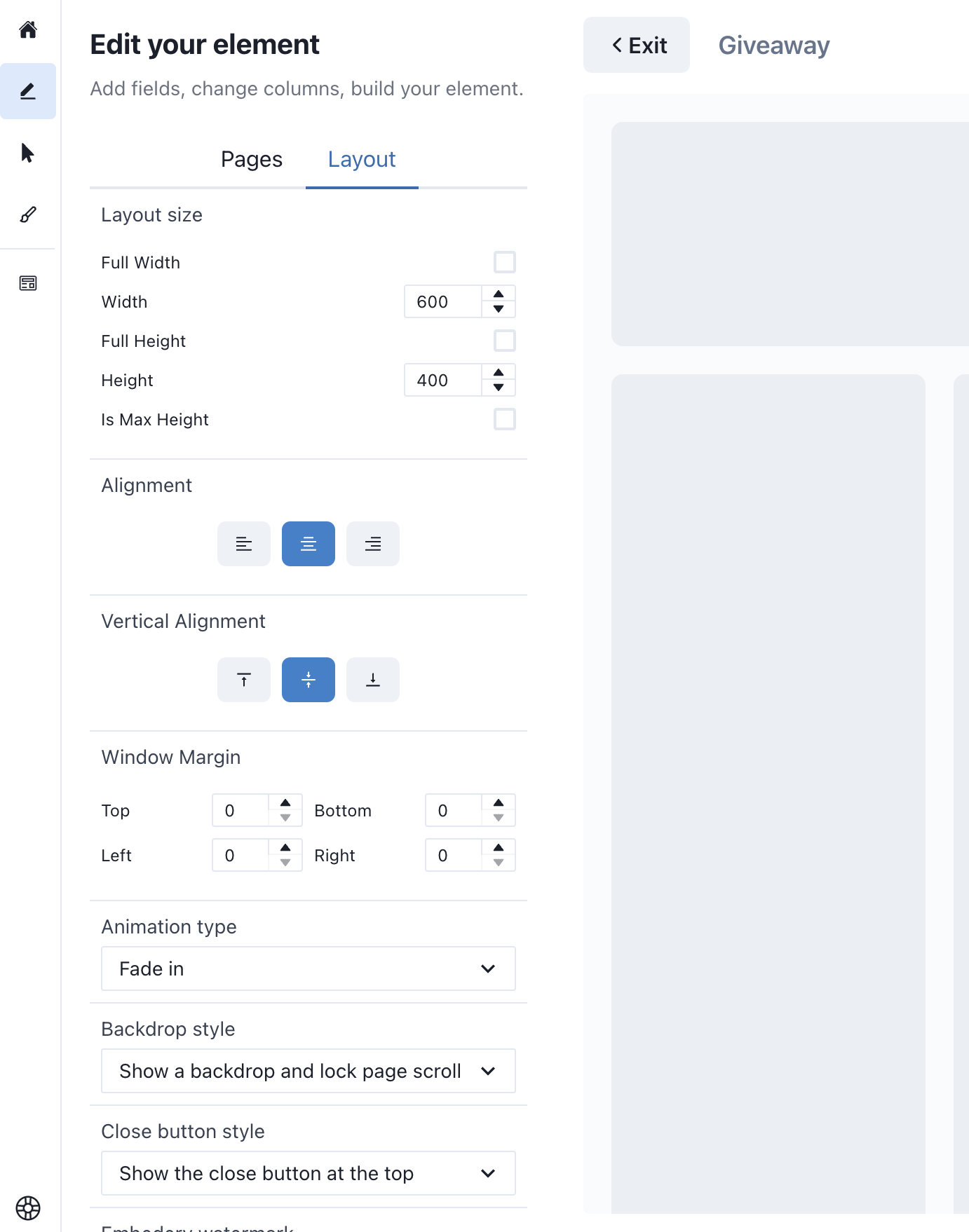
Layout options
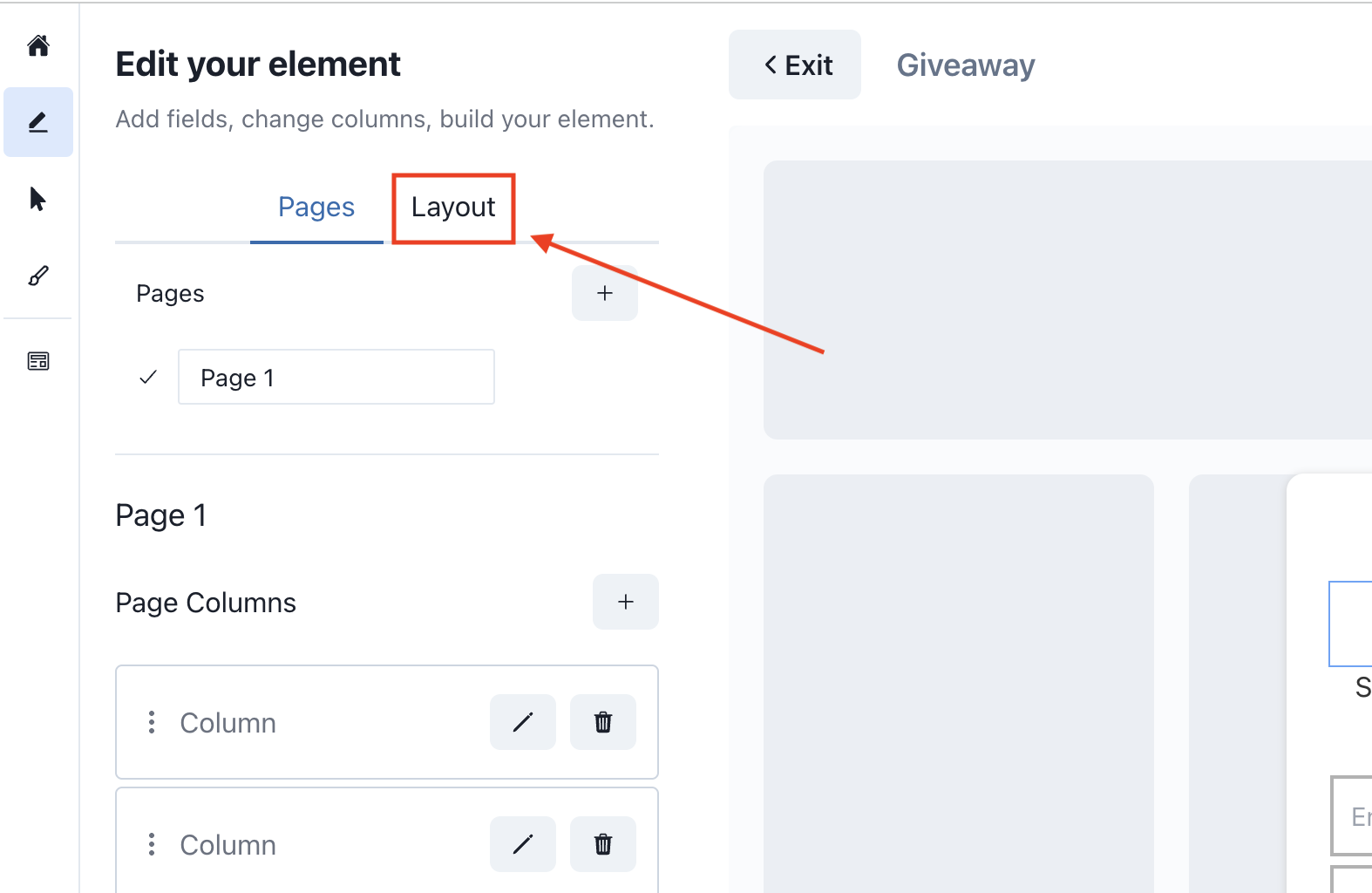
On the page edit sidebar, you will find layout options in the second tab.
The layout tab is used to allow you to customize the overall layout of your element, such as:
- The position on the webpage
- The width and height of the element
- Animation type, for when the element opens
- General options like if the backdrop is shown, the close button or even if the watermark is enabled.
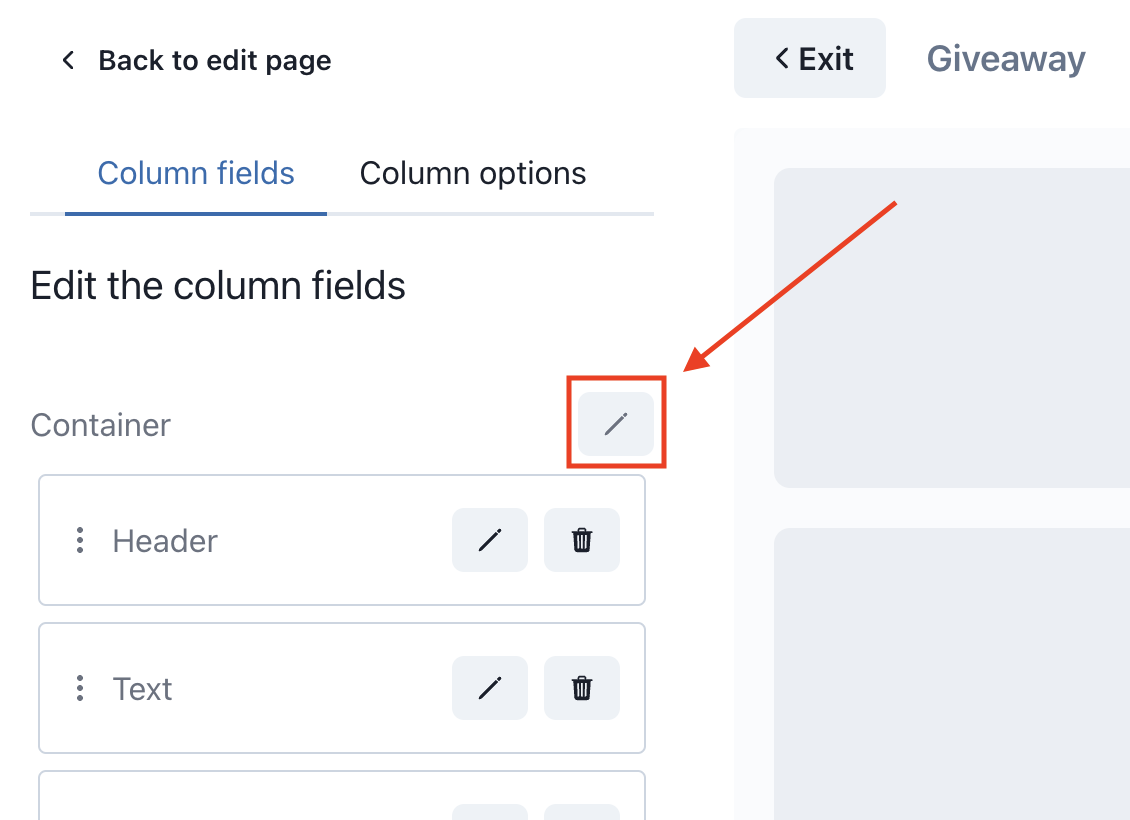
Column options
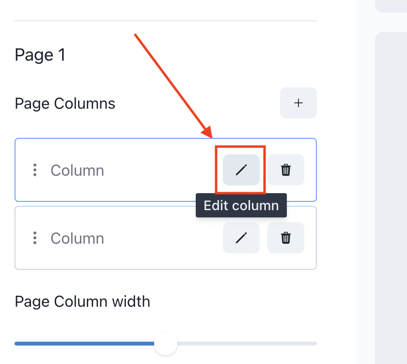
To edit your column options, click on the button as shown above. Hovering will show a tooltip explaining the buttons purpose.
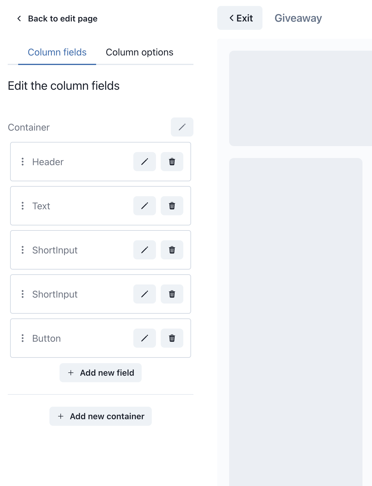
In this sidebar, you will be able to edit, reorder, delete and add fields to your column.
On top of that we break your fields into different groups called containers, containers can be moved around using the arrow actions. We'll talk more about containers below.
Reordering fields
So in this sidebar you can drag and drop fields around to reorder them in your popup. You can also move the fields between containers.
Adding a new field
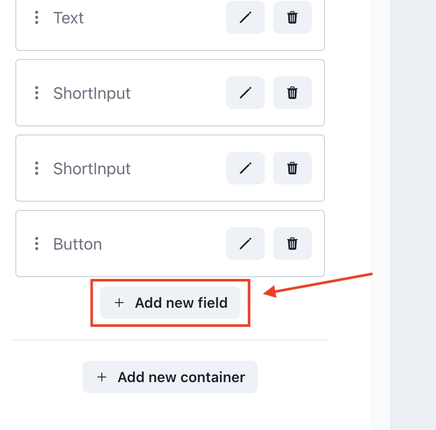
To add a new field, click on the button as shown above to open the new field modal.
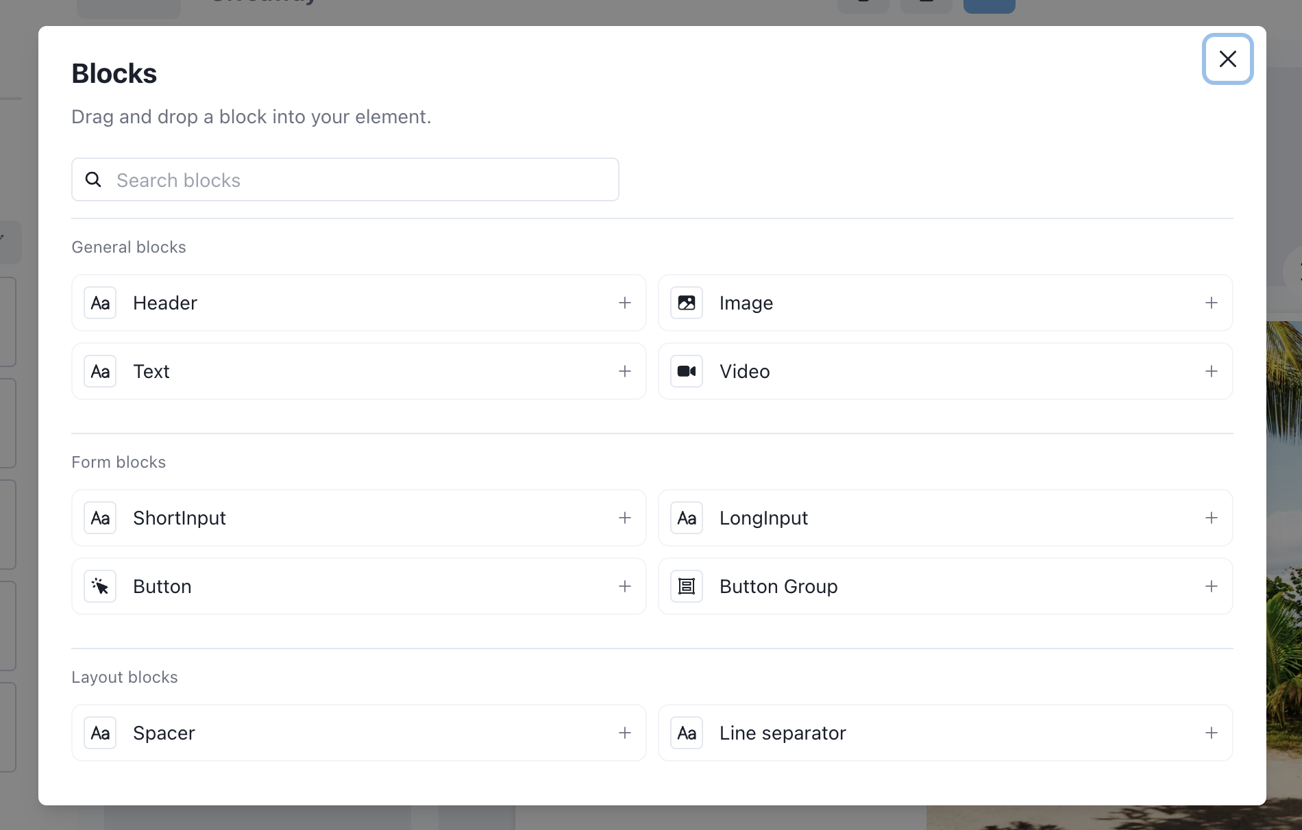
Here you can see all the fields available to use within your popup, we are constantly adding new fields.
Click on one of the options in the modal, and the new field will appear in the selected column.
Deleting fields
You can also delete fields using the trash icon button.
Field options
Once you click on the edit button of the field, the sidebar will change to the edit field sidebar. Here you can modify the settings specific to that field.
You may also notice in the live preview, the field will be highlighted using a green border.
In the image above, we have highlighted some things. They are:
1. To deselect the field
To deselect field you can either click on the "X" button in the top left, or you can click on the background of the live preview.
2. Variables
This is the variable editor, we will cover this in more detail in a future article. But here is where you define the variables your popup uses.
These variables are also made available in your goal user flow where you can dynamically change their value based on collected information from a previous step or based on the current customer.
3. Edit styles
This will open the style options, by default they are hidden to allow the theme to apply default styling, editing these fields will impact other elements in your element.
You can make the styles specific by changing the style variant, or creating a new one. Styles are bound to variants to allow flexibility over different typography and button styles you may need.
Container options
Container options can be accessed using the edit column sidebar and clicking the edit button as shown above.
Here you will have access to container specific options. Containers can be a great way to show two buttons next to each other in your columns.
Tips to mastering the editor
Play around with the options to see what you can create, also feel free to create a new element using a template. It can be a great way to see what is possible.
Editors can be complicated to understand, so take your time and please feel free to provide the Embedery team feedback. We are here for you.
My issue is still not resolved.
We are sorry to hear that you have not found the appropiate documentation to help solve your problem.
Please reach out to us and we will do our best to help.